Purdy Meyers
Discover how Wit & Craft partnered with Purdy & Meyers to deliver innovative solutions that blend strategic design with impactful branding. Explore our work and see how we help businesses achieve their creative goals with precision and purpose.

At Purdy Meyers…
we’ve extended the cocktail hour to a lifestyle of unequaled taste, refinement and joy. Always raising the bar, PM celebrates evenings filled with friends, good conversation and a healthy serving of laughter.
Ladies. And gentlemen.
Join us. And toast the good times to come.
Logo System
At Purdy Meyers, our logo system is meticulously designed to maintain our distinctive identity consistently across all platforms and media. From desktop headlines to the compact display on a mobile phone, choosing the appropriate logo is guided by its minimum size requirements.
Responsive Design
The Purdy Meyers logo was designed to be responsive, meeting minimum sizing requirements to ensure readability and legibility across all media

Primary

Primary With Tagline

Wordmark

Symbol

Monogram
Mark Building
The Purdy Meyers logo was designed to be responsive, meeting minimum sizing requirements to ensure readability and legibility across all media
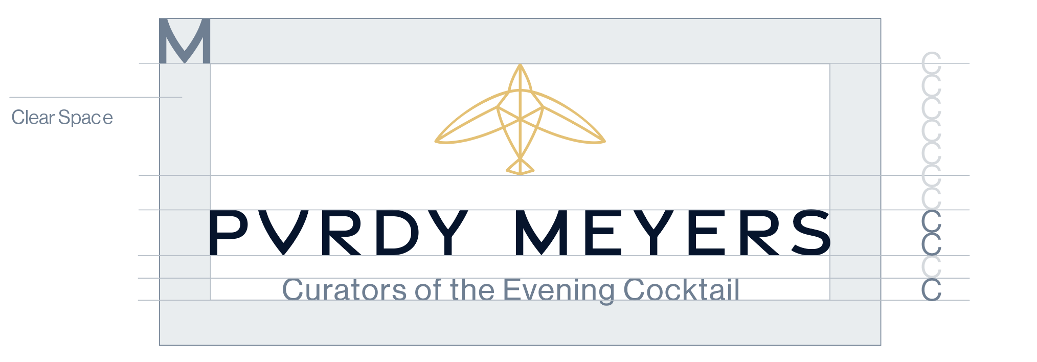
Primary with Tagline Logo Build

Logo Details
Color System
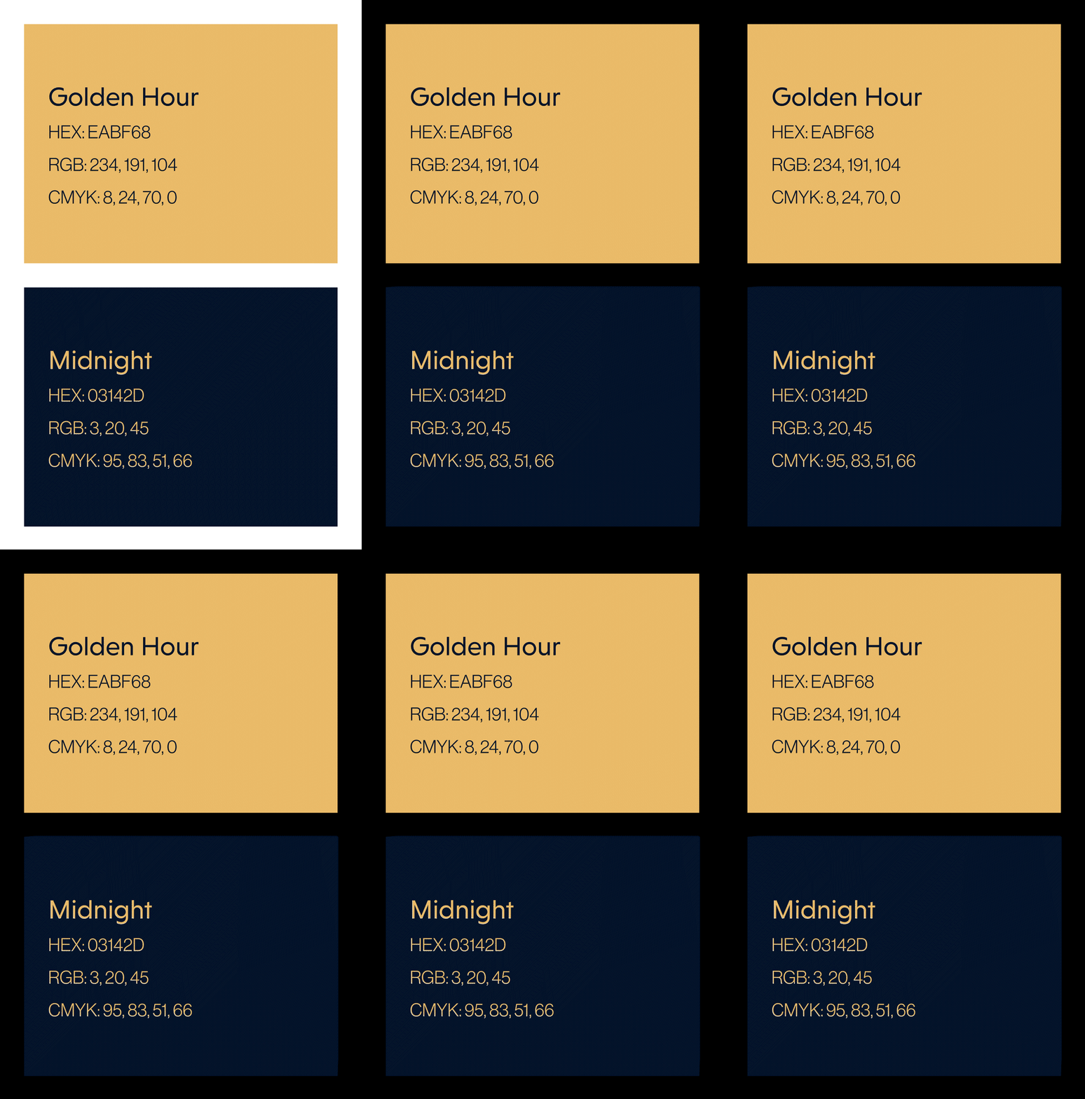
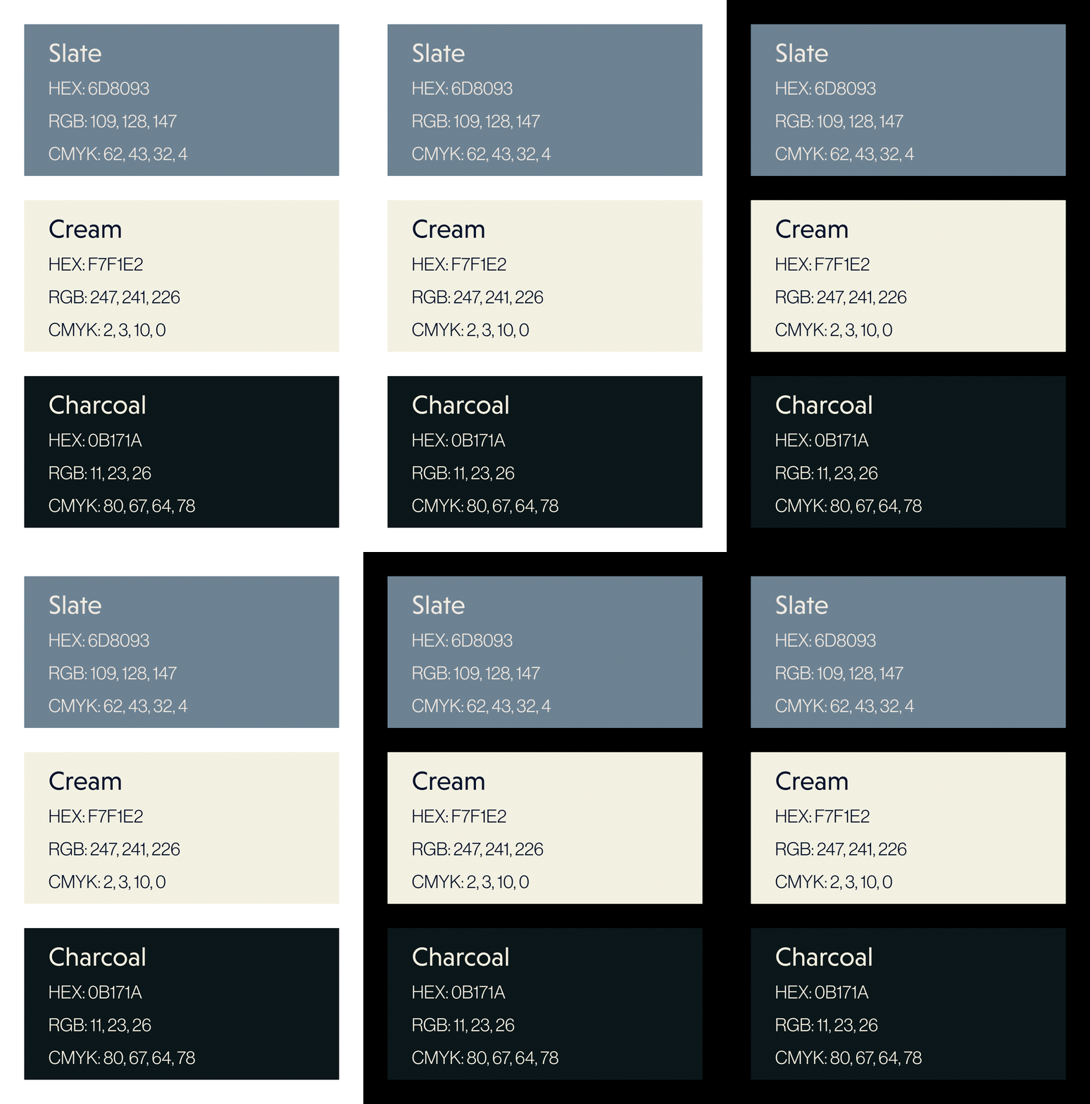
Consistency in using our brand colors across all media is of paramount importance. Our primary colors should be the most frequently utilized, while the secondary color palette complements them. We have shown below how they appear on both industry standard black and white backgrounds.
Primary Colors
Secondary Colors
Text Styles
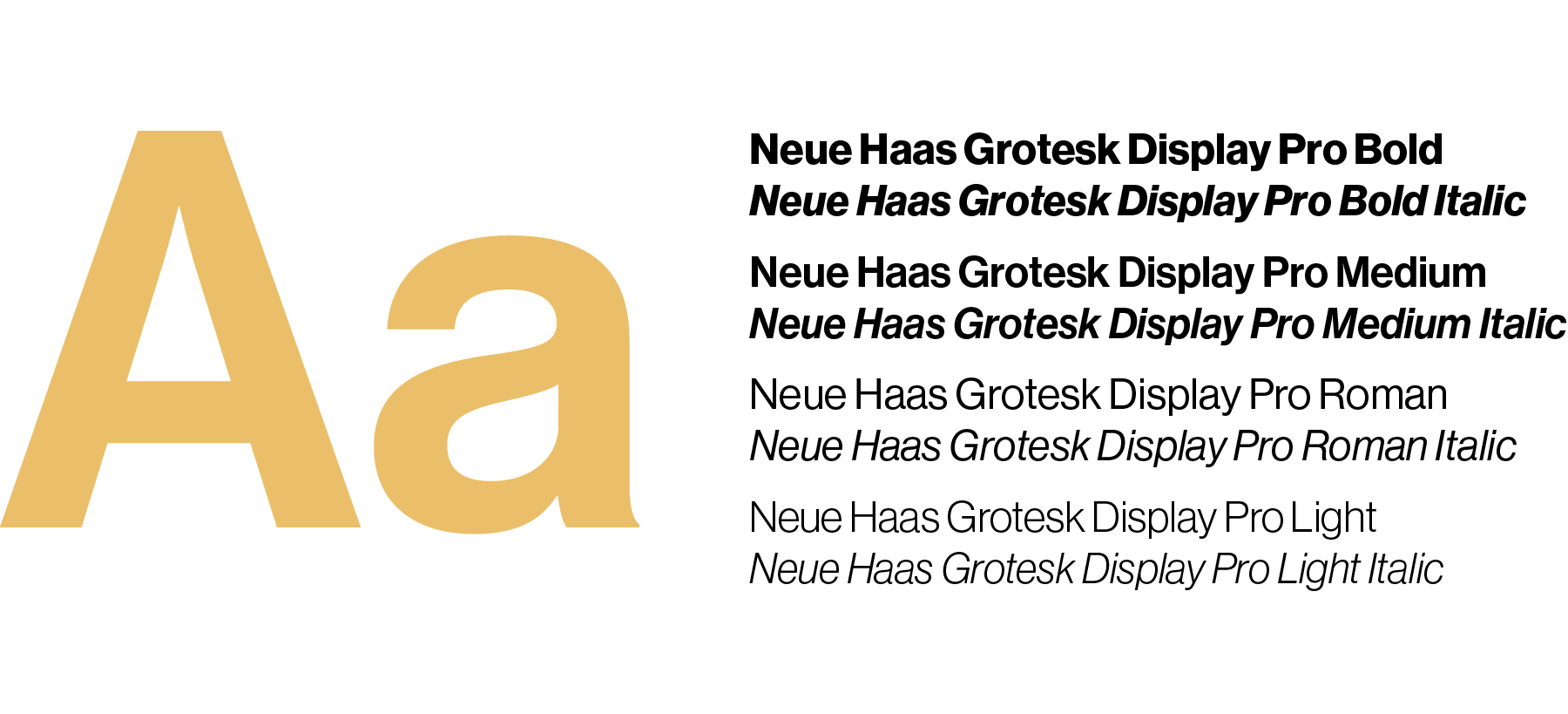
Our typography system is thoughtfully crafted to reflect our values and personality, making a lasting impression on our audience. We’ve carefully selected two typefaces, Niveau Grotesk and Neue Haas Grotesk Display, which work in harmony to enhance the Purdy Meyers brand.
PM’s typefaces have been specifically chosen to work in Squarespace.
Display Typeface
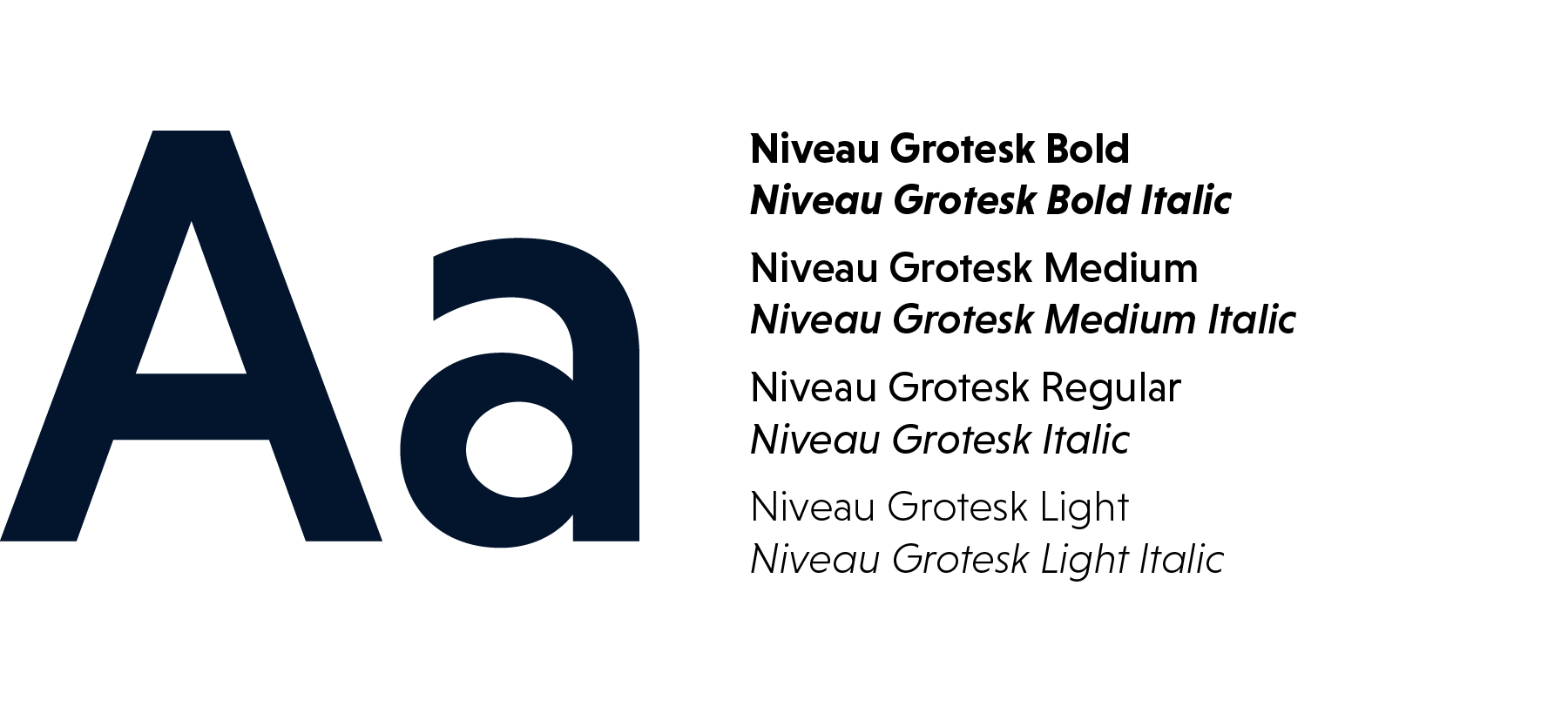
Body Text Typeface (System Font)
Type Ratios
To keep consistent type proportions, we change the size of the text by multiplying or dividing by 1.618 and rounding the number.
Usage Example


Tone of Voice
The voice of Purdy Meyers is class. With a healthy jigger of sass. Sophisticated and refined, yet approachable, knowledgeable and always fascinating. Engaging with PM is like sitting down at your favorite cocktail lounge for a well-deserved crystal-cut glass of whatever makes you sink into the well-worn leather chair and say, “Ahhhhhh, life is good.”
Far beyond the bar, we’re curating a Cocktail Community. A lifestyle of the finest in travel, entertainment, literature, decor, cooking and whatever appeals to our boundless sense of adventure.
So raise your glass, and your expectations. The time is right for Purdy Meyers.

Purdy Meyers Website
Visit the live site, maintained by Wit & Craft, here:

